
(Case study)
Sweat Equity Partners Corporate Website Redesign
Website design
Website: https://sweatequity.jp/
Refreshing the Brand Image and Delivering New Value
For the corporate website redesign of Sweat Equity Partners, which provides startup support and executive talent placement services, we handled everything from rethinking the information structure to UI/UX design.
The existing site had two key challenges: its service information was not systematically organized, and it did not convey the company’s credibility and expertise well enough. In addition, visitors include a diverse mix of business leaders, entrepreneurs, and investors, so the site needed “navigation that is easy for everyone to understand.”
For this redesign, we restructured the content of the entire site and built an information architecture that intuitively conveys the company’s services, business value, and culture. We redefined the brand’s tone and manner and created a visual design that balances credibility with a startup’s positive energy.
Scope of Work
- UX evaluation of the existing site and identification of issues
- Benchmark analysis of competitor and reference sites
- Information architecture (IA) design and content restructuring
- Wireframe design
- UI and visual design
- Component design (structured for future operation and additions)
- Responsive design for mobile and tablet
- Prototyping to validate user flows and usability
Key Improvements in the Redesign
- Reorganized the site into a structured information architecture so that services and support offerings can be understood at a glance
- Redesigned the site around a calm tone that conveys the company’s expertise and reliability
- Expressed the energy and speed of a startup-support company through accent colors and use of whitespace
- Organized the flows between pages and designed navigation that lets users reach the information they need without getting lost
- Optimized the placement and presentation of CTAs to encourage inquiries and contact
- Strengthened the visuals for team introductions, messages, the company overview, and other content that conveys the company’s character
- Used a component-based design so that future page additions and operational updates are easy

Dynamic Animation
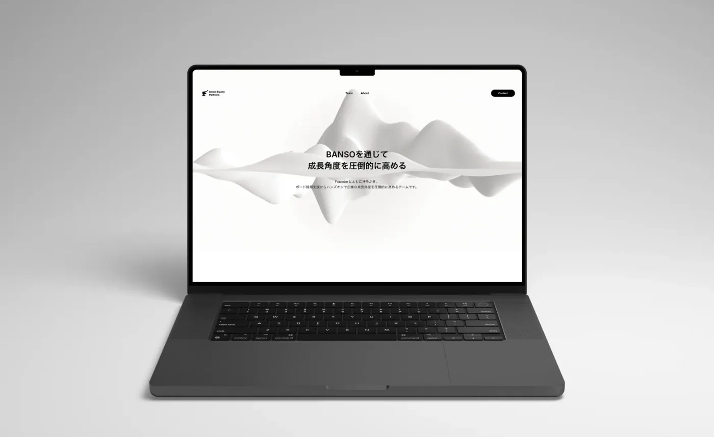
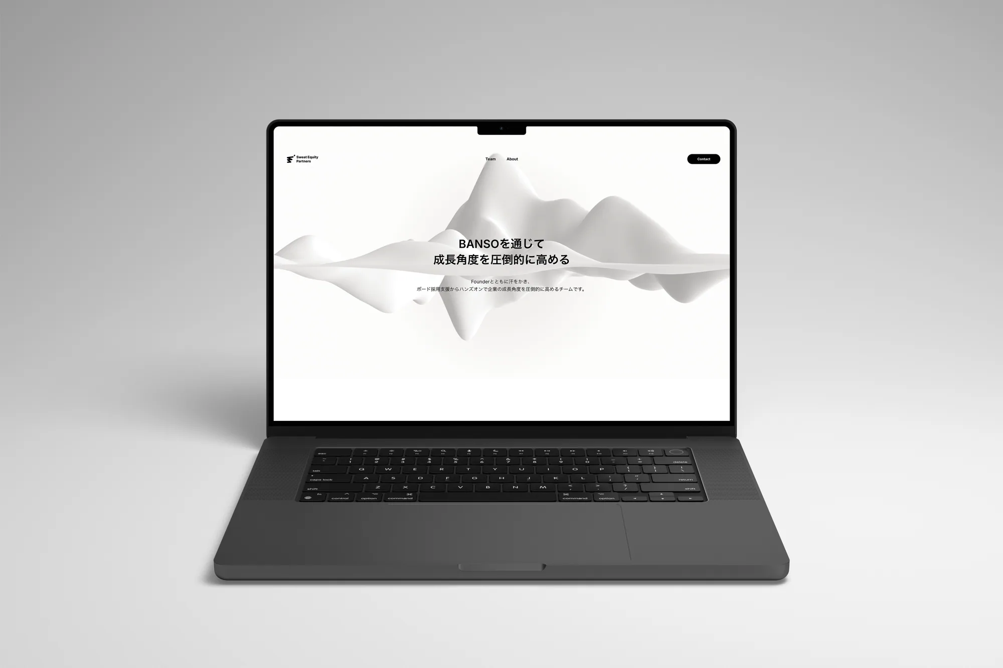
For the image at the top of the site, we used a simple, modern wave style that evokes “Sweat Equity Partners running alongside its clients.”
Outcomes
The redesign turned the site into one that clearly communicates the company’s business value and service structure, helping visitors understand the company better on their first visit.
The refreshed brand tone also expresses Sweat Equity Partners’ expertise, reliability, and innovative outlook through a consistent design. As a result, its appeal to prospective clients and partners has been strengthened.
In addition, thanks to the scalable component design, we built a site foundation that can flexibly handle the growth in pages that comes with new services and business expansion.