(Case study)
Sukkirin Corporate Website
Website design
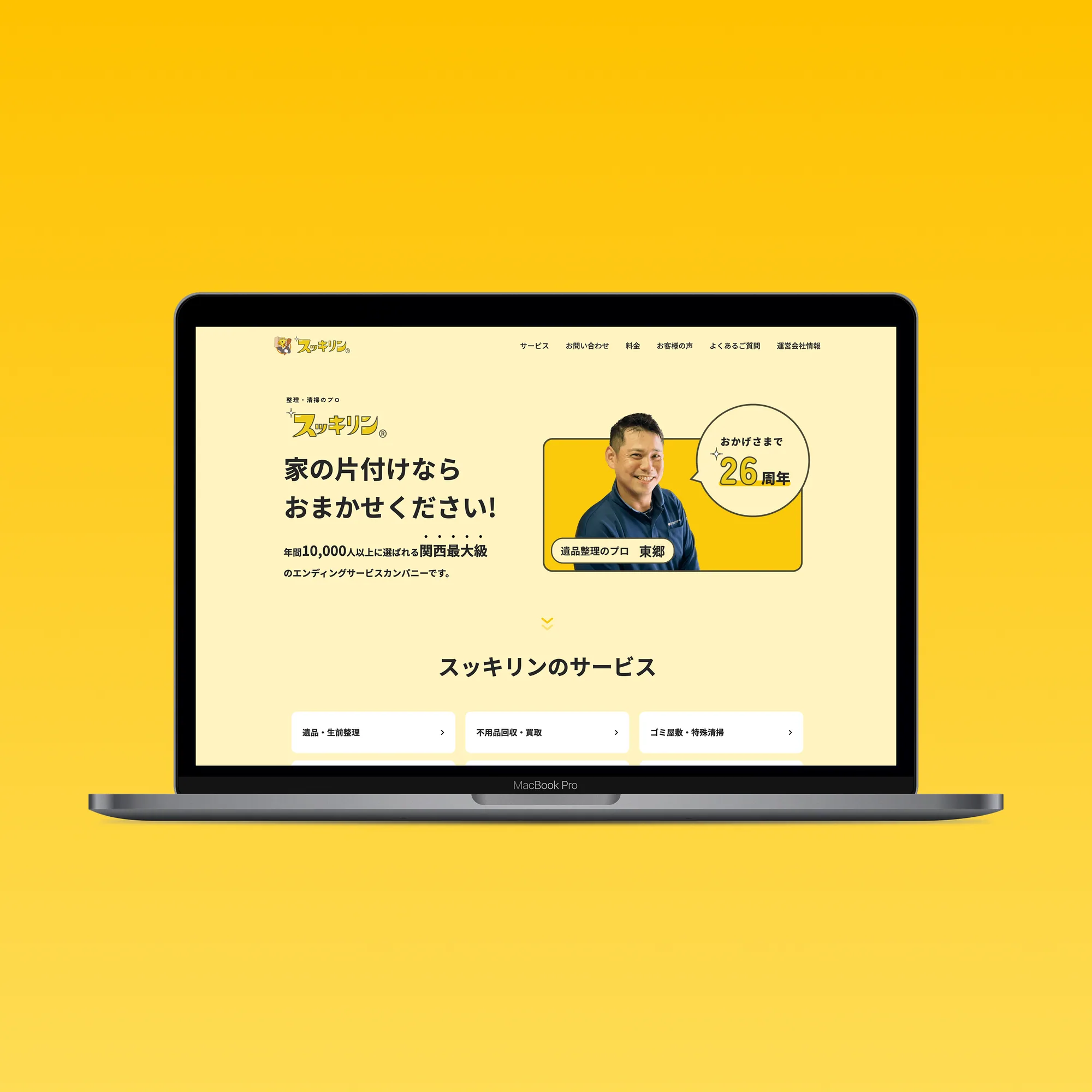
Introduction
Sukkirin
Sukkirin is one of the largest companies in the Kansai region, providing cleaning (“ending”) services and more.
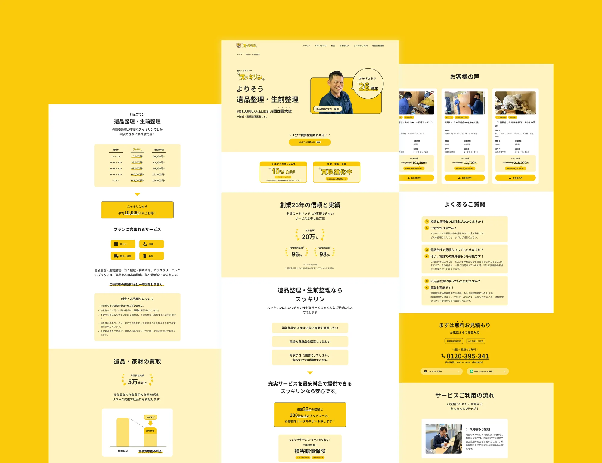
Its website had gone nearly 20 years without a design update. The design looked dated, and because the site carried a very large amount of information, the content the company most wanted to communicate was not coming across. The company asked us to redesign it.
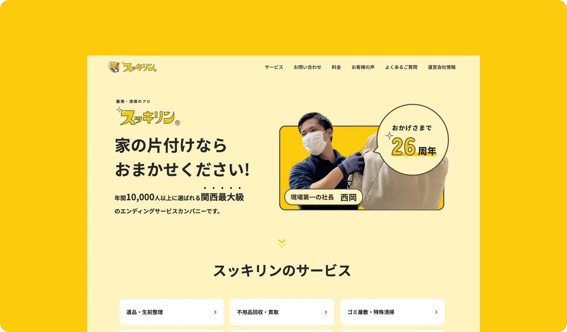
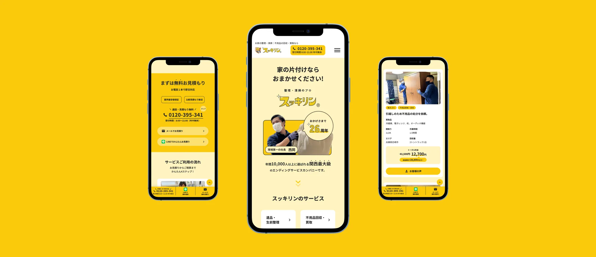
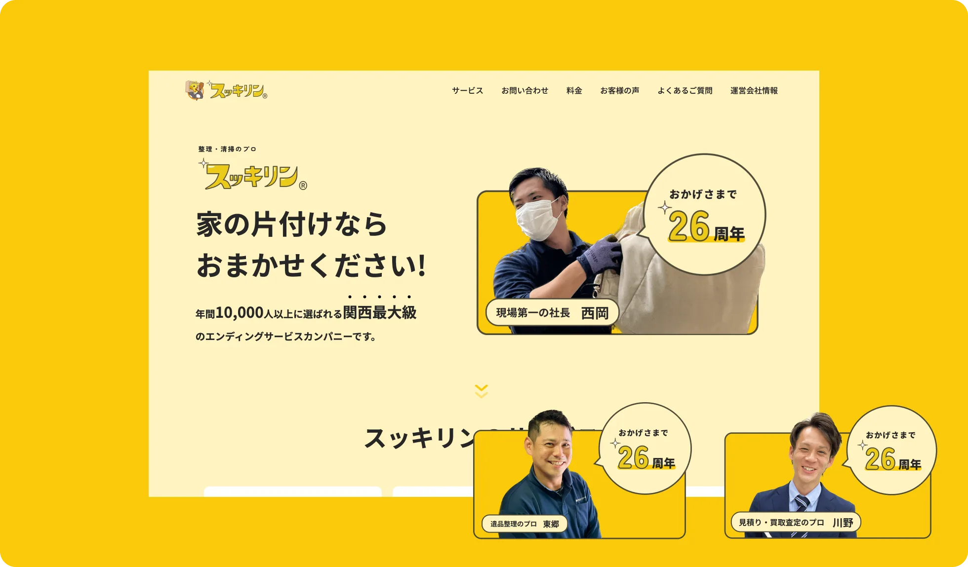
A Clear, Dynamic, and Approachable Design
We aimed for an approachable design. Throughout the website, we used bright colors consistently and added thoughtful touches such as accessible interactions.
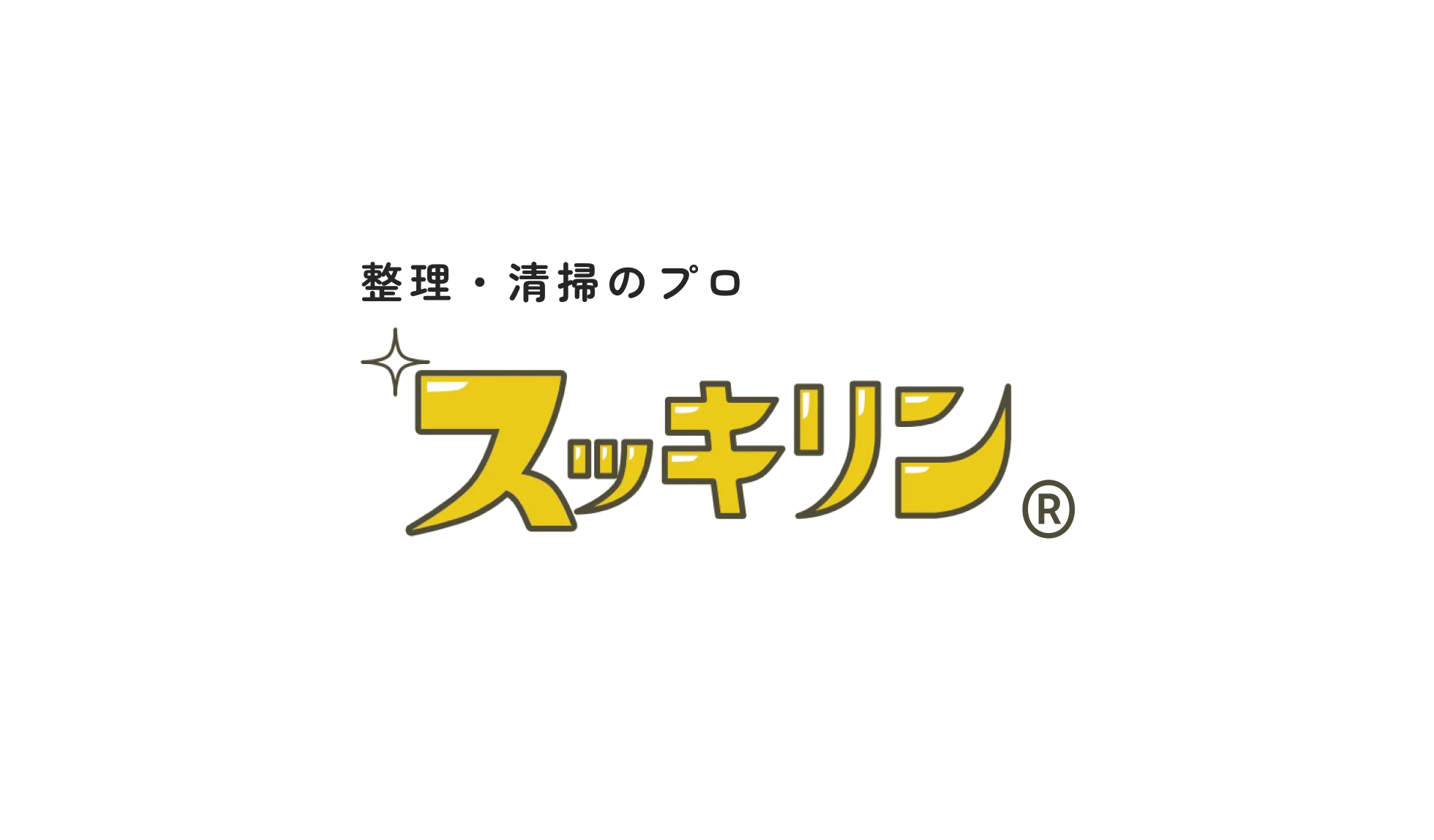
Redesigned Based on the Existing Logo
Sukkirin’s color palette is “bright and appealing.” We combined the brand’s primary colors with other highly saturated hues, aiming to convey enthusiasm, playfulness, and limitless possibilities to users.
Imagery
We rounded the edges of buttons and other elements so that users feel a sense of approachability.
The smiles of the staff at work are very memorable. We featured Sukkirin’s own staff on the hero page so that users can sense their enthusiasm for the service.